In Anamika Khanna
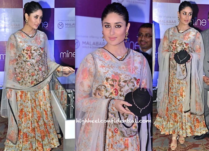
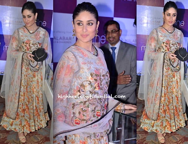
Wearing an Anamika Khanna suit, Kareena attended a press meet announcing Malabar Gold and Diamonds’ website launch. Beige sandals, striking earrings and her hair (wisely) worn in a knot completed the look. It’s a whole lot of floral but one that she wears well!
|
Kareena Kapoor At A Press Meet
|
Kareena Kapoor At A Press Meet
Photo Credit: Viral Bhayani
So pretty. She has such a lovely skin and that makeup is so good.
The suit in itself is so busy..but bebo did look good …hair,make up and earrings were choosen suitably but sandals? i doubt !!
She looks lovely!
Is it just me or she actually looks like her older self during K3G days? That suit is just okay !!!!
WOW! Kareena looks amazing as usual! Love the kajal and the hair. The outfit is gorgeous!
She looks classy and elegant. Her makeup especially looks fresh. A minor gripe is that I feel the hairstyle is aging her a bit but she still looks lovely.
and that’s how drapery can be turned into couture! Must be spring in some part of the world. But, but, but…Flawless neck-up.
My thoughts exactly. Too loud but nice neck up.
Wow. She looks so pretty. It’s a busy print and she carries it well by keeping everything else simple. I love her make-up.
I love the hair tied up and the make up. Clean and fresh.
Hi P&P,
The new look of the blog looks good expect I hate the white background. I loved the black.White is just too bright and jarring for the eyes.
The website looks just like any other fashion blog with the white background O well it might take a while to get used to Luv the font though. Miss the high heel picture on the right . Its like my lost mistress Sigh good things do come to an end 🙁
She looks great.
I know I’ve said this before, but please please bring the black background back!
I always welcome a change with open arms but the only suggestion i would give is that please incorporate that jumbo while pump into the layout somehow, I miss it . A different color this time maybe ! 🙂
And sorry bebo but this look is a bit too floral ! 😀
That is WAY too much floral.. cant get aboard with that fabric/print
and that “dupatta”
that’s like sofa upholstery – what’s happened to Anamika Khanna a former bastion of good taste she’s gone super-tack like Amarsons-Benzer vibe?
I can’t imagine anyone else carrying that monstrosity with such elan. Kudos Kareena!
Not many can carry off this look so well. Kareena looks great here 🙂
Despite the fact that she looks lovely, I think the whole look got too busy to showcase the jewellerygold/diamonds. She should have gone monochrome instead.!
aww bebo…you are such a stunner!! she really is a great dresser!(Y)
Hello P&P, May be you guys are trying to give a new look to your blog……but can you please change the site design back to your original. The new look is quite boring and dull.
Since you guys started, I have never missed a single post but I don’t want to come back anymore.
It doesn’t feel like home, the white hurts the eyes, the layout is like any other site, and I don’t feel connected to other people’s comments which sort of disappear in the background.
There you just said it…just isn’t home anymore..I recognised this site with the uniquely striking yet soothing black of the background and that giant white shoe on the right..besides why fix what isn’t broken, the current site does not seem something decidedly more convenient or progressive or easily navigable. Reiterating what Rana says it just makes all the comments fade into the background, a reply string hard to follow and all us old comrades dis-connected and lost…This isn’t nostalgia, I seriously recommend you guys go back to the old lay-out..
Thanks for the feedback. We actually fixed the reply string: now you can reply to a particular thread. Unfortunately, we won’t be going back to the old design. But, we are slowly incorporating functionality changes that all of you have asked for. 🙂
WHY? why can’t you just go back to the old layout? :S
Its about the viewers isnt it? And 99% of us want the old site back
It’s a commitment and this is ours. We like the layout and are sticking with it. 🙂
You don’t give up on a baby if it has issues, do ya? Well, this is our ‘baby’. And we’ll improve experience but between black and white, the white background is for here to stay. 🙂
We are on the other hand open to hearing what you are not liking about other functionality or browsing experience.
You wanted feedback – here’s some –
from user experience perspective, this new layout is not intuitive, takes time to learn the navigation. I can’t see the images most of the time, clicking on images brings out a new page.
This also doesn’t work consitently with different browsers. This is several steps backwards from the old layout.
Thanks B. When you say images bring out a new page, what image are you clicking. Would really really appreciate it if you could email us a screenshot. The new look is based on responsive design and it is meant to act differently on different browsers such as Ipads and IPhone and different browsers. Am curious to know what you mean by why works differently or isn’t consistent.
🙂