The text ‘here’ linking to Twinkle’s take on the same dress doesn’t look like a clickable link. Looks more like plain text unless I hover on it. Could be more intuitive about being a link.
So agree… There’s too much going on on your website P&P. The success of a site is how much time / number of actions I need to do to get to where I want to… Aesthetic comes next. Earlier one has to just scroll and go to the next page.. now the previous content is still there and needs two actions per post… It’s looking like a site that selling more than showing!
Are u guys trying to copy gofugyourself with this new design?
Whoever suggested this to you, needs to be fired/unfriendly asap. This is a terrible terrible idea and you’re going to lose a bunch of your readers.
I hate the new format. I cannot seem to navigate the pages and it’s so easy to get lost on it. Pls get the old format back or I’ll simply have to go on some other website to get info. Functionality should come before aesthetics
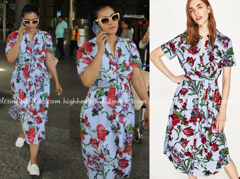
Lolol. Trying so hard to “look” fashionable. The dress which looks easy breezy on the model looks stuffy on her. And those shades are tacky af.
The text ‘here’ linking to Twinkle’s take on the same dress doesn’t look like a clickable link. Looks more like plain text unless I hover on it. Could be more intuitive about being a link.
Hey guys sorry but this new format is so hard to navigate. Kills the fun out of the website. Please dont fix whats not broken!
So agree… There’s too much going on on your website P&P. The success of a site is how much time / number of actions I need to do to get to where I want to… Aesthetic comes next. Earlier one has to just scroll and go to the next page.. now the previous content is still there and needs two actions per post… It’s looking like a site that selling more than showing!
i agree.. its really hard to navigate…
hate the new format! please go back to the way it was
Your new format is terrible and anything but intuitive. Please don’t ruin the hhc experience!
I agree.. totally hate the new format..
AGREE WITH VISH AND SAMEERA 100%..U GUYS ARE KILLING THE FUN
Dislike the new format. Too many steps to read one single post. Especially on the iPad!
Also , Kajol seems to have the dress right but everything else is a big NO. The shoes ?, the sunglasses ?, the ponytail ?….
It’s as if she tried tooo hard to look effortlessly chic like twinkle but alas, you gotta have some serious style to impersonate Twinkle.
Kajol looks good.Everyone need not look like a model.People have a problem if stars overdress or even if they look normal.
Are u guys trying to copy gofugyourself with this new design?
Whoever suggested this to you, needs to be fired/unfriendly asap. This is a terrible terrible idea and you’re going to lose a bunch of your readers.
I hate the new format. I cannot seem to navigate the pages and it’s so easy to get lost on it. Pls get the old format back or I’ll simply have to go on some other website to get info. Functionality should come before aesthetics
Love this dress, it looks great on her. The chunky white shoes and sunglasses are bringing the look down.
Yes please go back to the old format