In Madison
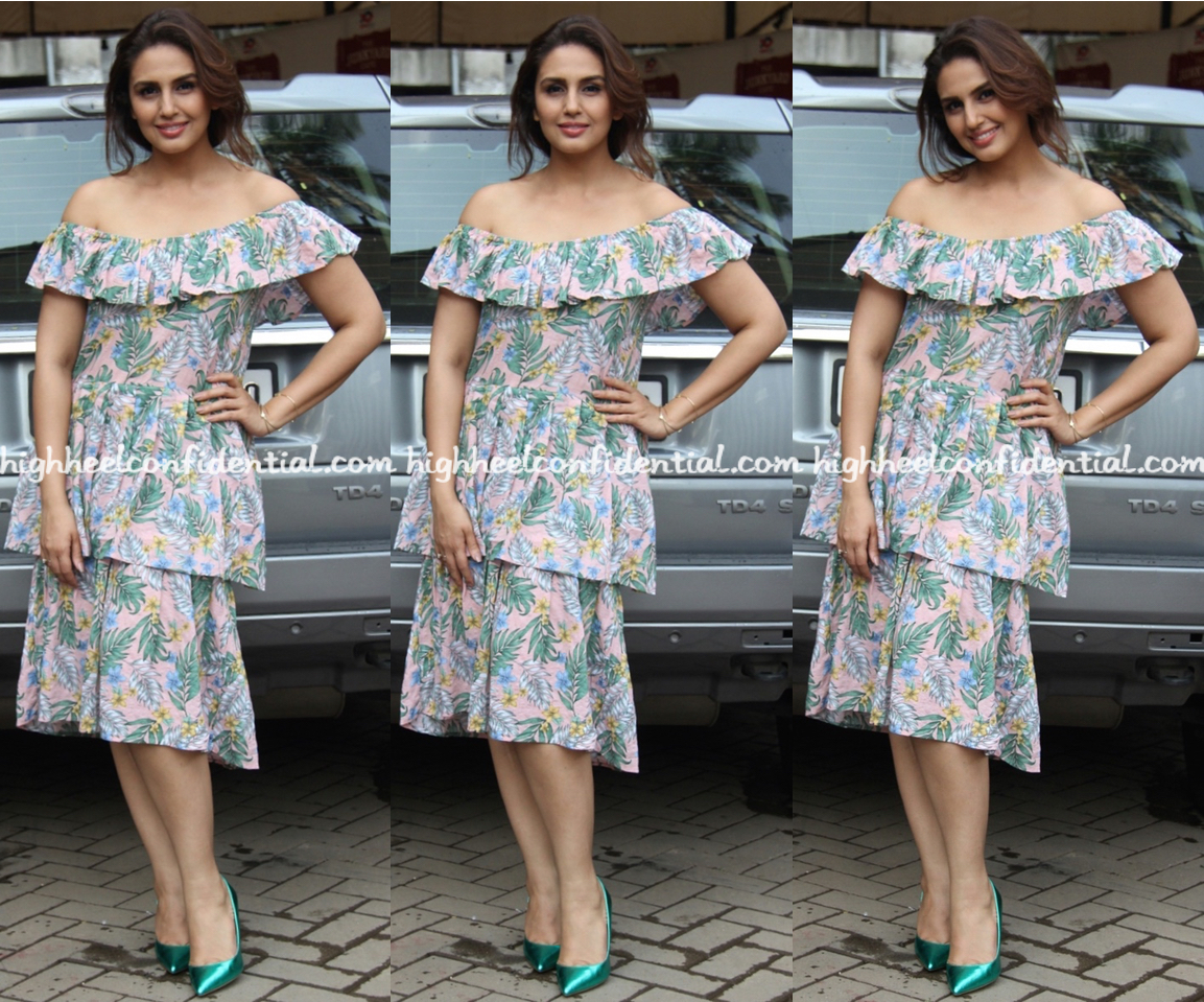
Wearing an off-shoulder printed dress by Madison, Huma promoted her upcoming movie recently. Pair of green pumps and a wispy updo rounded out the actor’s look well. Between the ruffle and the length, the dress’ proportions aren’t the most flattering but it’s hard to fault Ms. Qureshi waist up.
|
Huma Qureshi At Partition 1947 Promotions
Photo Credit: Viral Bhayani
This web site redesign is making it so hard to browse all the pictures 🙁 I loved your previous style so much.
I agree. It is very time consuming to move from image to image
I hate the new design. It is annoying. I think won’t be visiting this website too often .
I feel the same. 🙁
Like the easy breezy feel to it..would love to wear !Huma looked lovely and refreshing ..
Bdw .. one reason of coming to ur website was that it was so easy to navigate and gave daily dose of fashion with minuscule effort but now things seem to have changed alot.
And i am all in for the look upgrade but It has become a pain with this new look.
I agree .. it’s a pain..
Exactly. Navigation has become so cumbersome! Also, can not locate previous pages!
+100
I so agree. I’m not resisting change. More than that, the website is visibly difficult to navigate through. I don’t think it is the case of “getting used to it”; don’t think we will be able to get familiar to this complex format, ever irrespective of the time. Reading posts & comments is no more fun. :-/ P&P had an edge in their simplicity.. don’t why I can’t really look at them like our “P&P” with this format. This looks commercialised!
I concur. HHC is a website I browse during quick breaks at work. I dont have the time or want to take time to navigate the complex new format. Good bye HHC.
I am thinking on the same line…to bid adieu!Though too addicted to hhc, new format is eating too much of time n energy!
Guys, I understand you wanted to change the website to accommodate new additions, but do keep the “Celeb style” section the way it was – the current “Read post” is extremely annoying and tedious – sucks the joy out of celeb fashion browsing experience 🙁
I think the ads are taking up way too much space and it’s so confusing to see a celeb pic and adjoining it an ad with a model in it , it’s all too hotch potch…
The ads needs to be streamlined a bit and not be so in your face, it seems as if HHC has moved on from good content to just ads and promotions . Much like most print magazines which nobody wants to read anymore. Only if your content is priority, will you get more viewership, nobody wants to view advertisements.
The try hard who does not have the slightest clue on what suits her body type. That messy hair is adding to the unkemptness.
Totally agree. The previous web format was much better. Please please go back to the previous one if possible!
This format is killing the fun,it is way more complicated …pls simplify it and revert to the old ….this is annoying and taking away the fun…
Agree with everyone else. Don’t like this format at all.
Now HHC too looks like every other fashion website 🙁 Your USP was your simple format and now you lost it.
She looks lovely – easy breezy and casual. But those shoes don’t go with the vibe of the dress at all.
i couldn’t agree more. i loved loved going through HHC during quick breaks. The previous format was so easy to read and fun. Pls pls go back to that. This new format is waaay too complicated. and not as much fun..sigh!!
Agree on the format – while it looks stylish, I think it is too tough to navigate 🙁 Any chances of reverting to the older, simpler style?
Like the dress on her actually. Very easy breezy and the hair and makeup suits. The shoes need to be buried though
My hair looks exactly like that when I wake up in the morning. Didn’t know that was called a ‘wispy updo’.
This off-shoulder, relaxed dress needs a sandal, not those metallic pumps.