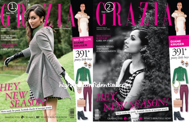
Shraddha on Grazia:(Un)Covered
For the big September issue, Grazia went with two covers featuring Shraddha in Dior (on both). Question is, which cover do you prefer?
|
Shraddha Kapoor on Grazia September 2013 Double Cover
Photo Credit: Viral Bhayani
how gorgeous!! i should start subscribing to grazia..
the first one for sure ,, though nothing much can be said about either i feel the first one looks more lively with her looking straight into your eyes also the side profile of shradha is not much to talk about !
This makes a refreshing change since I’m bored of seeing Sonam and Deepika being featured in magazines one after another. That being said, i wished they had shown the dress more, couldn’t see much from the both the covers.
Cover 2. She looks stunning and classic. Cover 1’s a bit generic.
First one i like !!!
Very pretty woman.
She is gorgeous. But not sure of the looks. Second one, i cant even see much of the dress. First one is pretty okay.
Pretty Girl! second one, i absolutely LOVE the side profile of shradha.
And black and white is always classy.
I’m not sure why the second one is a cover, given she is not even looking at the consumer (traditionally mag covers will try and draw you in with eye to eye contact) nor is it too high-fashion and to top it all off its in b&w which isn’t Grazia’s usual aesthetic.
I can only imagine someone really fell in love with that photo.
i really want that grey overcoat. sigh…
Love both but my pick would be #1 is very vogue anna wintouresque. Classy girl Love shraddha
Everything is so effortless with this girl super jealous.