Kareena On Femina: (Un)Covered
The August edition or this? Which Rohit Bal creation do you like better?
|
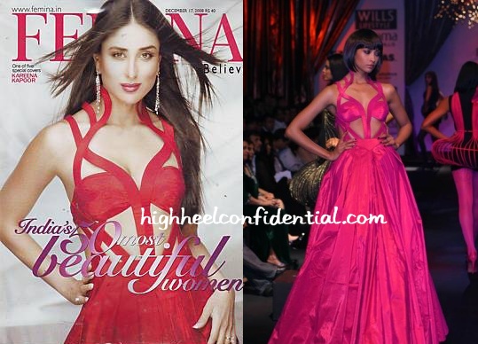
Kareena Kapoor, Femina December
Rohit Bal, Autumn 2008
The August edition or this? Which Rohit Bal creation do you like better?
|
|
Kareena Kapoor, Femina December
Rohit Bal, Autumn 2008
That’s a tough call! Both the gowns are equally ugly.
@Sonia- LOL 🙂
Actually Kareena’s look on the femina cover looks so dated.. the earrings and styling completely destroy the look..
This one fares a bit better than the August.
this look is so blahh! Very un-flattering for kareena.
I’d go for the August look. The gowns are definately ugly, but her face looks a lot better in the August issue.
this looks like really really horrible lingerie
i totally agree!^^
kareena looks whack!
What an ugly outfit!! The things that people will wear for a label…sigh!
Long Live Photoshop, it sure can sculpture your face and make it look foxy like Karena here
agree with sonia…..n i think kareenas face looks photoshopped her cheek bones are rather prominent otherwise
the styling, the look…the earrings, that hair and that lipstick aww…the dress too actually, she doesnt have the assets to hold it up…ruined!
Can we all say EWWWWWWW!!!!!!
Is that dress supposed to look like that or are all those cuts for ventilation? Thumbs down all the way!
OOh it looks like a spider on top of a tent!how ugly
love Rohit Bahl and the dress does its purpose on a magazine cover
however, the styling IS very dated- especially the makeup and earrings
speaking of mags- did you guys see Laxmi Menon in the US edition of Vouge?
she was featured in an article and in a photoshoot as well
The gown is for sure bad, I prefer the August one (again, only because I had to pick). Actually, I have a problem with naming it “India’s 50 most beautiful women”! Can’t the call it beautiful celebrities/models/actresses?? What do you guys think?
But I kinda like what it does for Kareena’s shape. And red has always been a good color for her.
ewwwww
and i thought bebo has a chic dress sense
this looks like something from the early 90s…i can almost imagine mamta kulkarni there
with the white face and red lips and red dress with random straps everywhere
ewww! both r ugly gowns!
blah. the august is better but only because you made me pick.
is it just me or are the poses/hairstyling/makeup of celebrities on indian covers not as great as international ones? i dont know what it is… they just all seem so repetitive to me!
also, red can be done so beautifully – anyone seen the december cover of vogue with jen aniston on it??
monstrously ugly gown, these celebs are suckers for anything ‘designer’!
strangely i think this gown is very interesting and it is flattering her quite a bit.. but agree with the earrings .. they dont go well with the gown at all.. never did like the august gown.. so its all ok
kareena looks good..
@ manisha, jen aniston did look smashing on the vogue cover…except for her hair which i usually love!
ugggglly.. her hair, makeup and tat dresss is ewwwww
Definitely a cover dress, but the earrings have a very bleeeeh effect.
didn’t bipasha wear something like this once??
I hate the expression in her eyes..self indulgent – something like – oh I’m so cool..look
ugly gown… i can’t understand y did someone choose that gown over such lovely creations of Rohit Bal from other collections…
hate everything about this cover. including that silly ornate font which just seems to add to the mismatched feeling .. Kareena looks good but very dated styling.
Most of Rohit Bal stuff.. is not exactly wearable or sometimes too lavish or…..verrry surprisingle unique. Like what exactly is the model wearing who is walking backwards on the ramp..
August cover gets my vote!!!
relatively speaking, definitely the August cover.
Kareena loks so ugly!
There is something wrong with her, she has changed so much in the past few monts!
She does not look good at all.
noone!
If I remember right, Indrani Dasgupta was wearing the same dress last year on the cover of Cosmopolitan sometime in July or August. I like the August cover, she looks healthier alright.
But if its just about the dress, then I think the Cosmo cover looked wayy better!